- Why Color for Study Room Matters for Focus and Productivity
- Why Color for Study Room Matters for Focus and Productivity
- 15 Mindful Color Palettes for Study Room to Enhance Focus
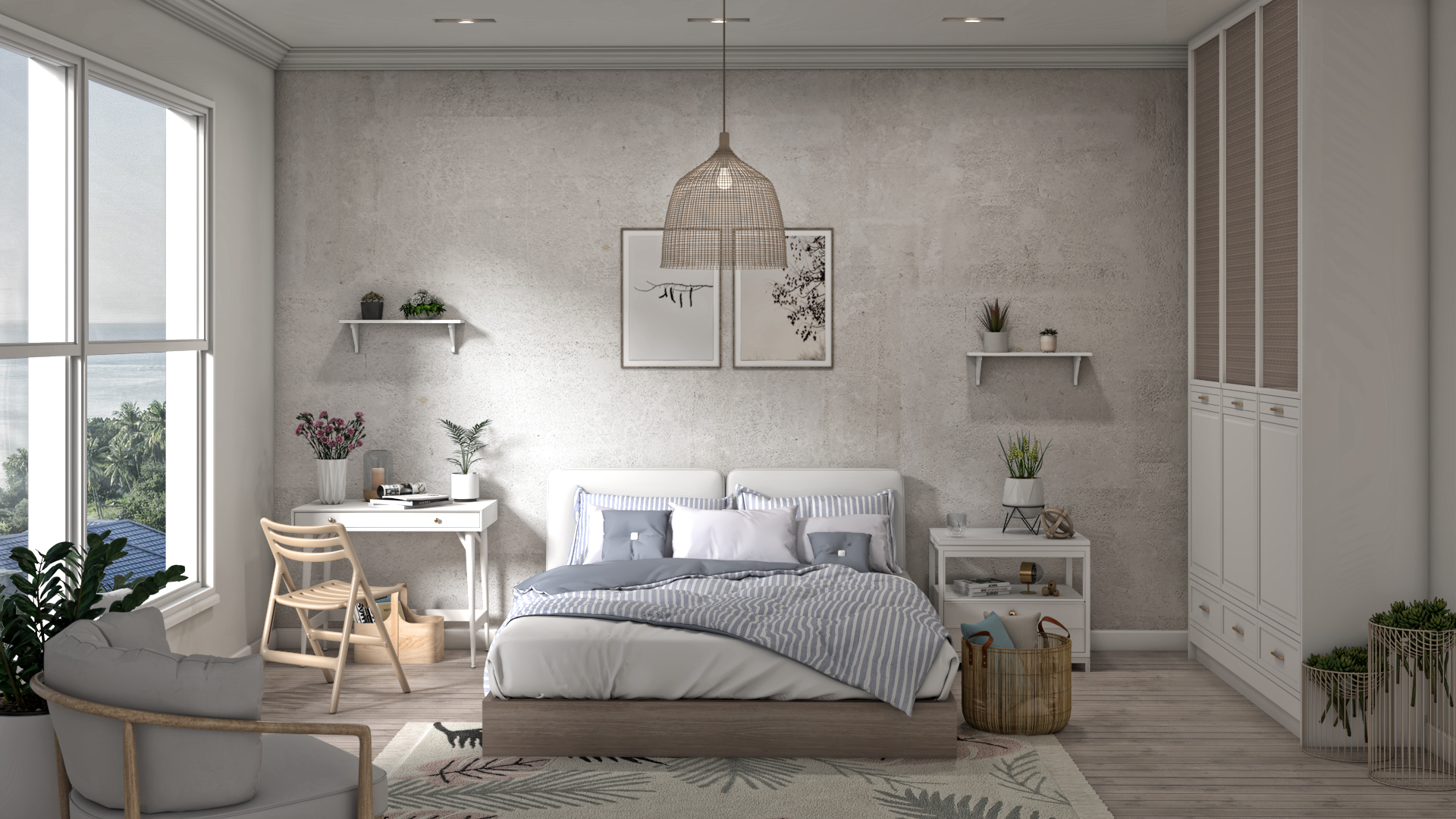
- Soft Blue & White – For Maximum Focus
- Sage Green & Beige – For Calm and Long Study Hours
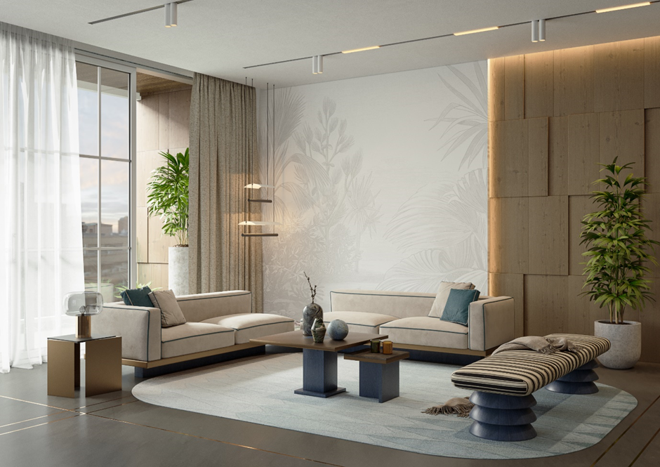
- Warm Neutrals (Taupe & Cream) – For Minimal Distractions
- Light Yellow & White – For Positive Energy
- Grey & Blue – For Modern Study Rooms
- Pastel Pink & White – For Soft Focus Environments
- Dark Blue Accent with Neutral Base – For Deep Work
- Mint Green & White – For Fresh Thinking
- Earthy Brown & Off-White – For Grounded Focus
- Lavender & Grey – For Stress-Free Studying
- White & Wood Tones – For Clean and Natural Focus
- Teal & Grey – For Balanced Focus and Creativity
- Beige & Olive Green – For Subtle Sophistication
- Sky Blue & Light Grey – For Small Study Rooms
- Soft Peach & White – For Warm and Inviting Study Spaces
- Unique Insight: How Lighting Changes Your Study Room Color Impact
- How to Choose the Right Color for Study Room (Step-by-Step Guide)
- FAQ
A study room should feel calm, clear and easy to return to every day. In many Indian homes, it may be a child’s homework corner, a work-from-home setup, a reading space or a quiet room for focused thinking. The colours used here can shape how the space feels and functions.
The right color for study room walls, furniture and accents can reduce visual noise, support concentration and make long hours feel less tiring. A thoughtful study room wall paint choice can make a compact room feel open, a formal study feel warmer or a child’s room feel encouraging without becoming distracting.
At Design First, colour is considered with lighting, finishes, furniture, materials and the way the room is used throughout the day. Here are 15 mindful study room colour combinations to help you choose the best color for a study room for your home.
This attention to detail helps create an iconic experience where every design decision contributes to a more comfortable and productive environment
Why Color for Study Room Matters for Focus and Productivity
Some rooms feel tiring before work begins. Sometimes the lighting feels harsh, the contrast feels heavy or the colours become visually tiring after a few hours . Other rooms feel dull, making it harder to stay motivated. A well-planned color for study room helps create the right balance.
Blues can bring clarity, greens often feel restful and warm neutrals reduce visual clutter. Brighter tints can bring vitality but be distracting if overdone. This is why the best color for a study room is not simply the most attractive shade, but the one that supports how the room is used.
For students, the combinations should help with reading and revision. For professionals, it should feel focused and camera-friendly. For children, it should feel cheerful without becoming visually loud.
Why Color for Study Room Matters for Focus and Productivity
Some rooms feel tiring before work begins. Sometimes the lighting feels harsh, the contrast feels heavy or the colours become visually tiring after a few hours. Other rooms feel too dull, making it harder to stay motivated. A well-planned color for study room helps create the right balance.
Blues can bring clarity, greens often feel restful and warm neutrals reduce visual clutter. Brighter tints can bring vitality, but they can also become distracting if overdone. This is why the best color for a study room is not simply the most attractive shade, but the one that supports how the room is used.
For students, the colours should help with reading and revision. For professionals, the room should feel focused and camera-friendly. For children, it should feel cheerful without becoming visually loud.
Lighting can completely change how a colour feels throughout the day. A blue may feel fresh in daylight but cooler at night, while beige may look warm under soft lighting but flat in a room with limited sun.
This is also why colour decisions work better when they are considered alongside lighting, materials and furniture finishes rather than in isolation.
The Design First Style Test helps homeowners understand their preferences, while the design-to-build approach ensures the final colour scheme works with materials, lighting and execution.
Thoughtfully planned custom made furnitures can further enhance functionality by making the best use of available space while complementing the chosen colour palette
15 Mindful Color Palettes for Study Room to Enhance Focus
Every study room has a different rhythm. Some are used early in the morning, some after school, some through the workday and some only in the evening. The right shade depends on room size, light, age, work habits and interior style.
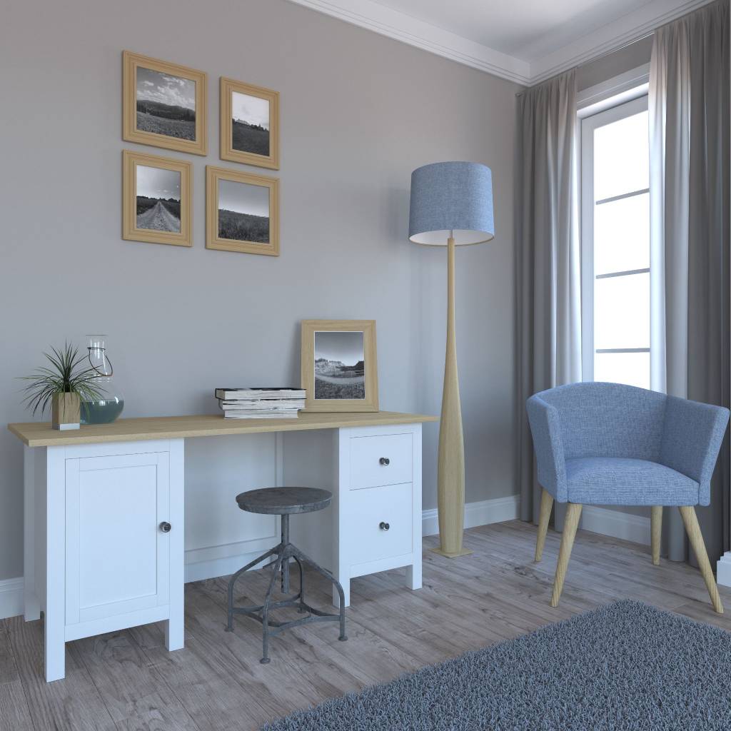
Soft Blue & White – For Maximum Focus
Soft blue and white create a relaxed, clear study room. Blue brings order, while white keeps the space bright and open.
Use a lighter blue as the main study room wall paint or behind the desk. White shelving, ceilings or cabinetry can balance the look. Choose powder blue or grey-blue instead of bright shades.
A successful study room often balances ergonomics and aesthetics, ensuring the space remains both comfortable and visually appealing during long hours of use
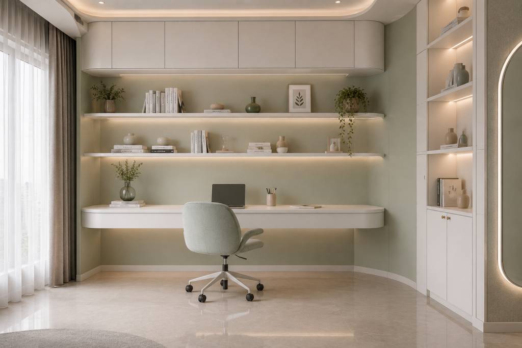
Sage Green & Beige – For Calm and Long Study Hours
Sage green and beige feel restful, warm and grounded. Sage brings sleekness, while beige keeps the room from feeling too cool.
This is one of the most practical study room colour combinations for long hours. It works well with wood, cane, linen, brass lighting and indoor plants.
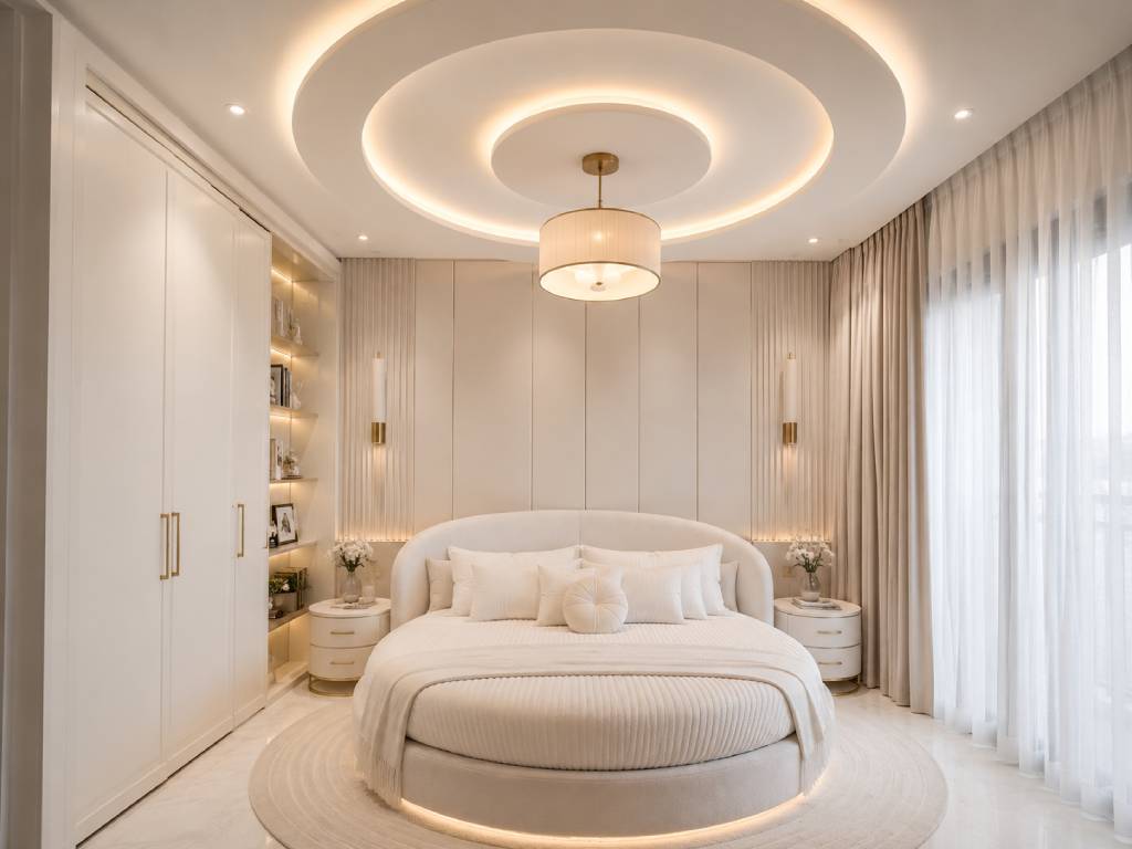
Warm Neutrals (Taupe & Cream) – For Minimal Distractions
Taupe and cream are perfect for a peaceful, distraction free study environment. The taupe provides depth, the cream keeps it light.
This look suits small rooms, bedroom study corners and shared spaces. Add texture through blinds, shelves, rugs or a fabric pinboard so the room does not feel flat.
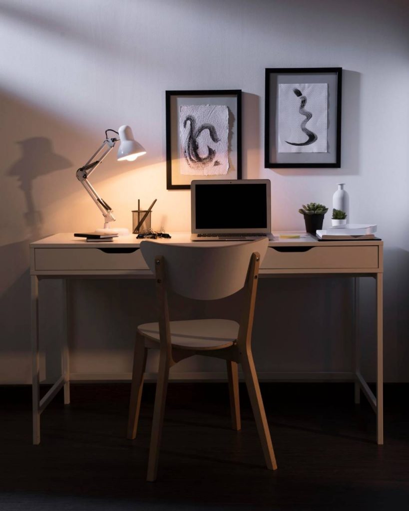
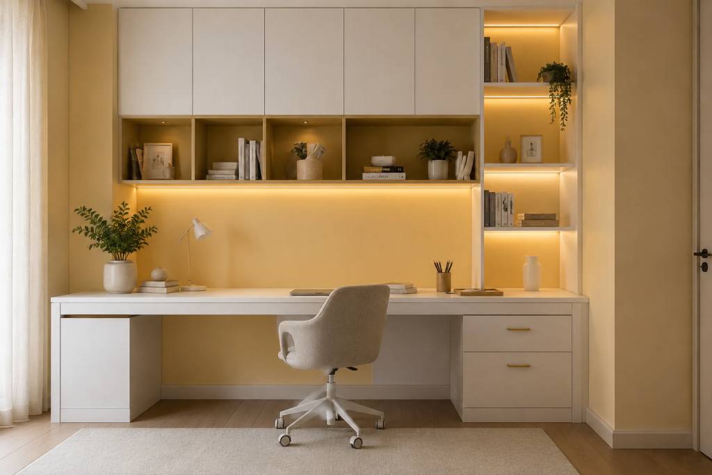
Light Yellow & White – For Positive Energy
Light yellow and white bring warmth and optimism. This paint choice works well for children’s study areas, creative corners and rooms with limited daylight.
Choose pale lemon, butter yellow or muted ochre instead of bright yellow. White furniture and simple storage keep the look balanced.
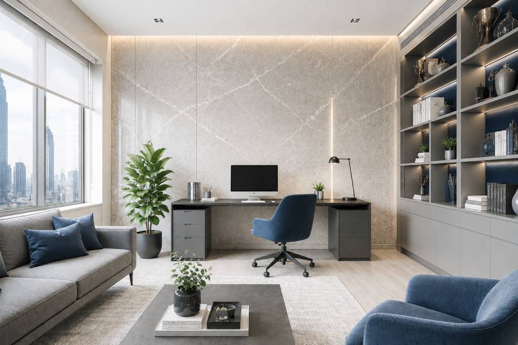
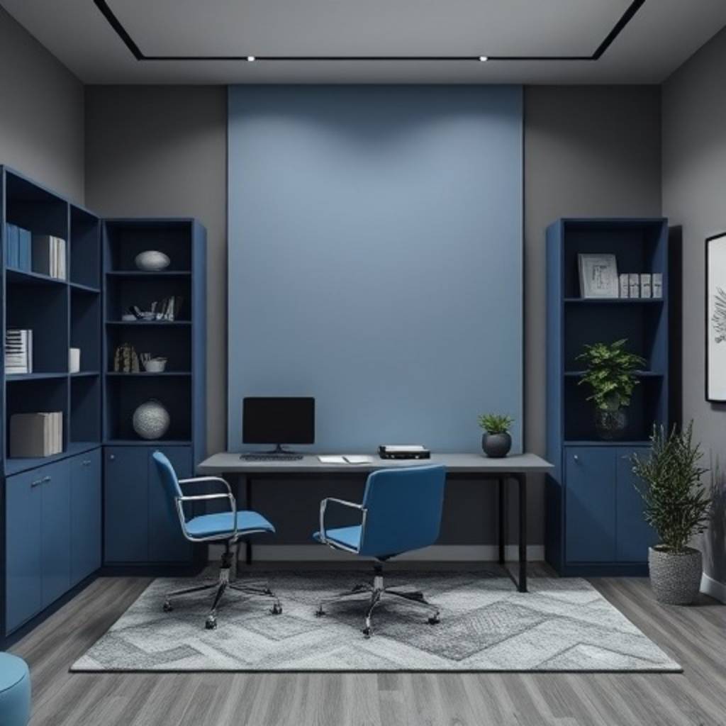
Grey & Blue – For Modern Study Rooms
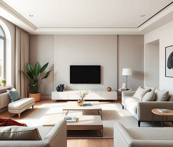
Grey and blue create a composed, modern study room. Grey provides structure, blue supports attention.
Use grey as the base and blue as the accent via shelving, chairs, artwork or a focal wall. It also works great for home offices and as a background for video-calls.
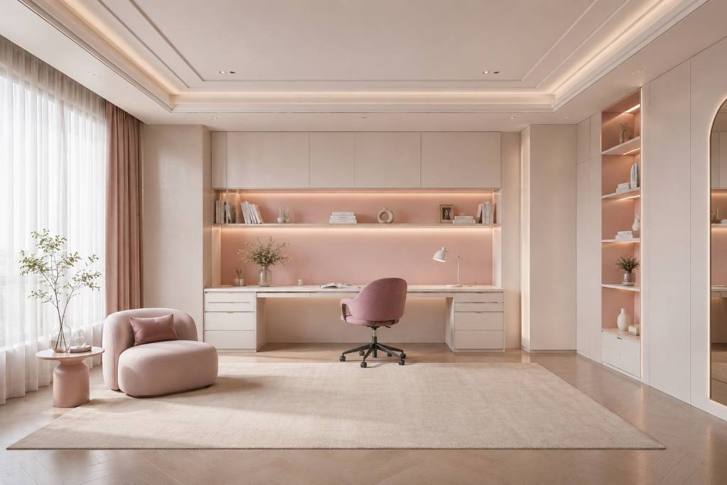
Pastel Pink & White – For Soft Focus Environments
Pastel pink and white create a gentle, comforting study room. Muted pink can feel soothing rather than decorative.
Choose blush, dusty rose or pale pink, balanced with white furniture, light wood and warm lighting. It suits teenagers, young adults and creatives.
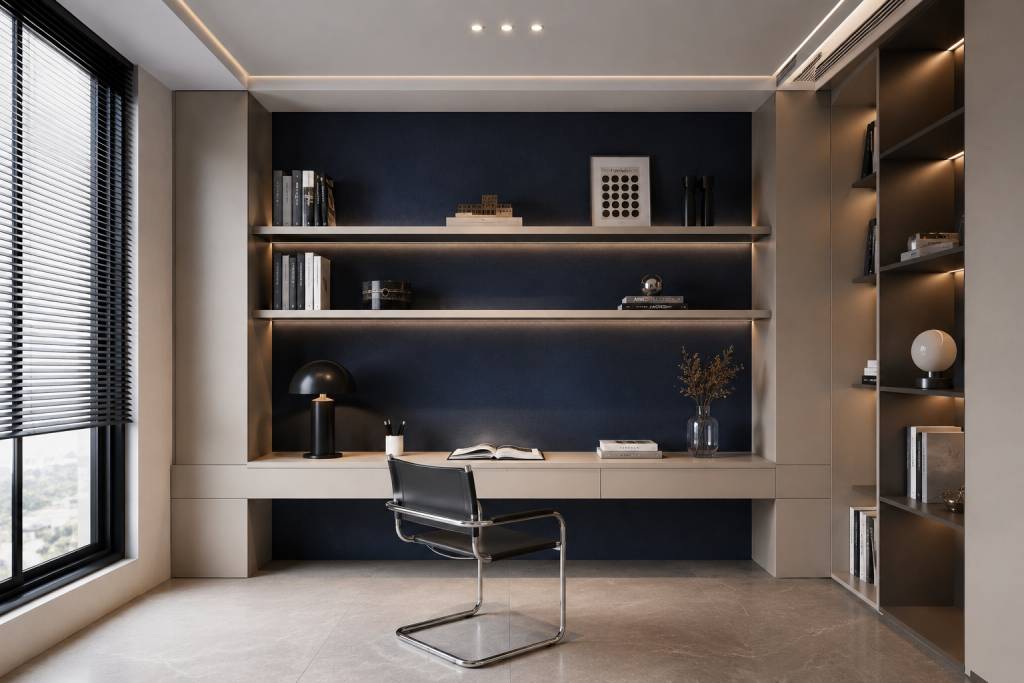
Dark Blue Accent with Neutral Base – For Deep Work
Dark blue can create concentration and depth when used carefully. Instead of painting every wall, use it behind the desk or bookshelf.
Balance it with beige, white, taupe or light grey. Good task lighting is essential, making this a strong study room wall paint idea for reading rooms and home offices.
Mint Green & White – For Fresh Thinking
Mint green and white make a study room feel fresh and bright. Mint gives an easy energy and white keeps the space open.
These shades works well for small rooms, creative workspaces and study nooks that need more lightness, pairing mint walls with white shelves and pale wood for a fresh, open feel.
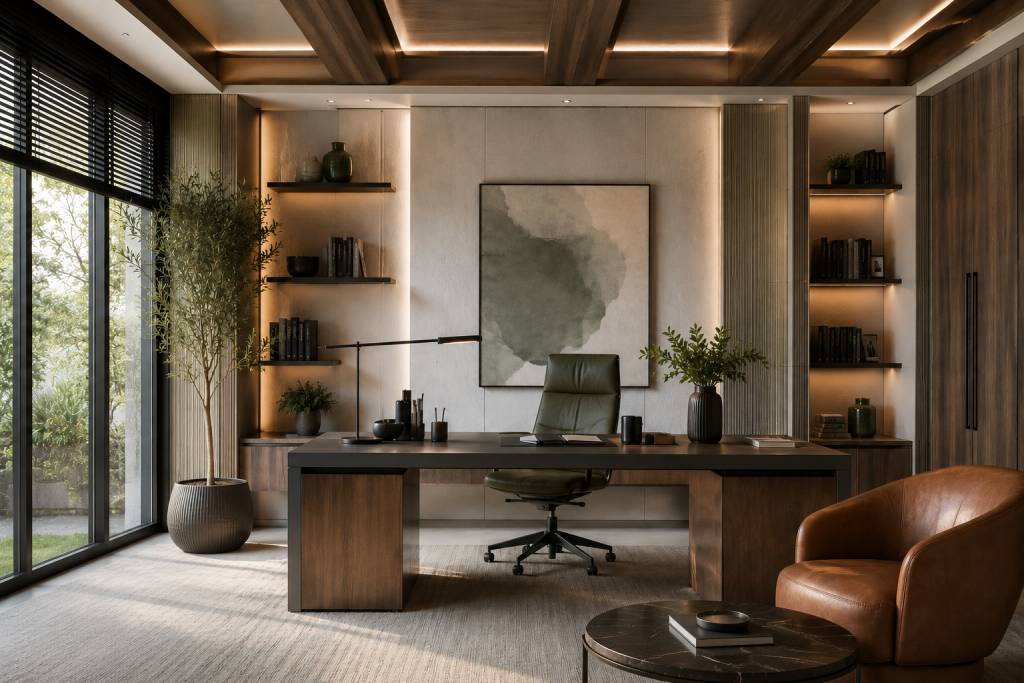
Earthy Brown & Off-White – For Grounded Focus
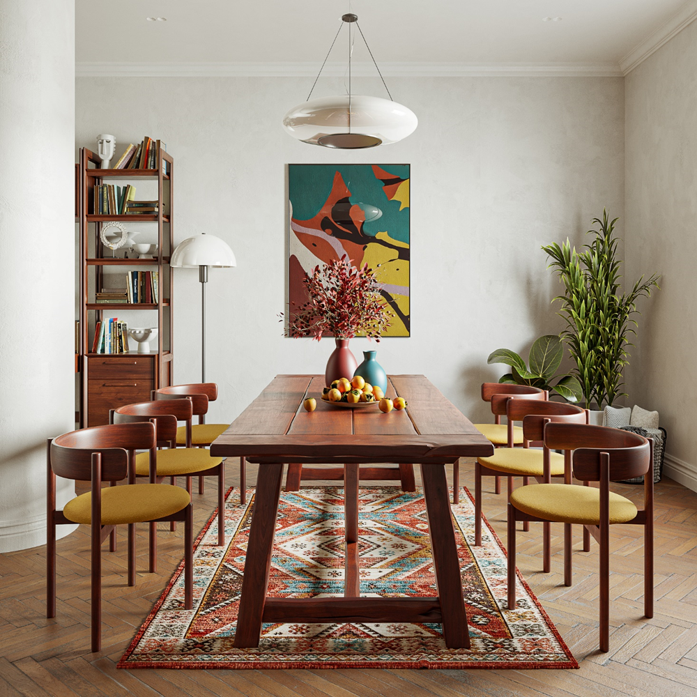
Earthy brown and off-white provide a solid, mature study space. Brown is warm and off-white prevents it from becoming too heavy.
This choice is especially appropriate for traditional interiors, home libraries and formal study areas.
![Earthy Brown & Off-White Colour Palettes for study room]](https://www.designfirst.co.in/blogs/wp-content/uploads/2026/05/chart-9.jpg)
Lavender & Grey – For Stress-Free Studying
Useful when tranquillity is as important as productivity: lavender and grey. Lavender balances the room, grey adds structure.
Choose muted lavender, lilac-grey or mauve instead of bright purple. Keep the furniture simple and the lighting gentle.
![Lavender & Grey Colour Palettes for study room]](https://www.designfirst.co.in/blogs/wp-content/uploads/2026/05/chart-10.jpg)
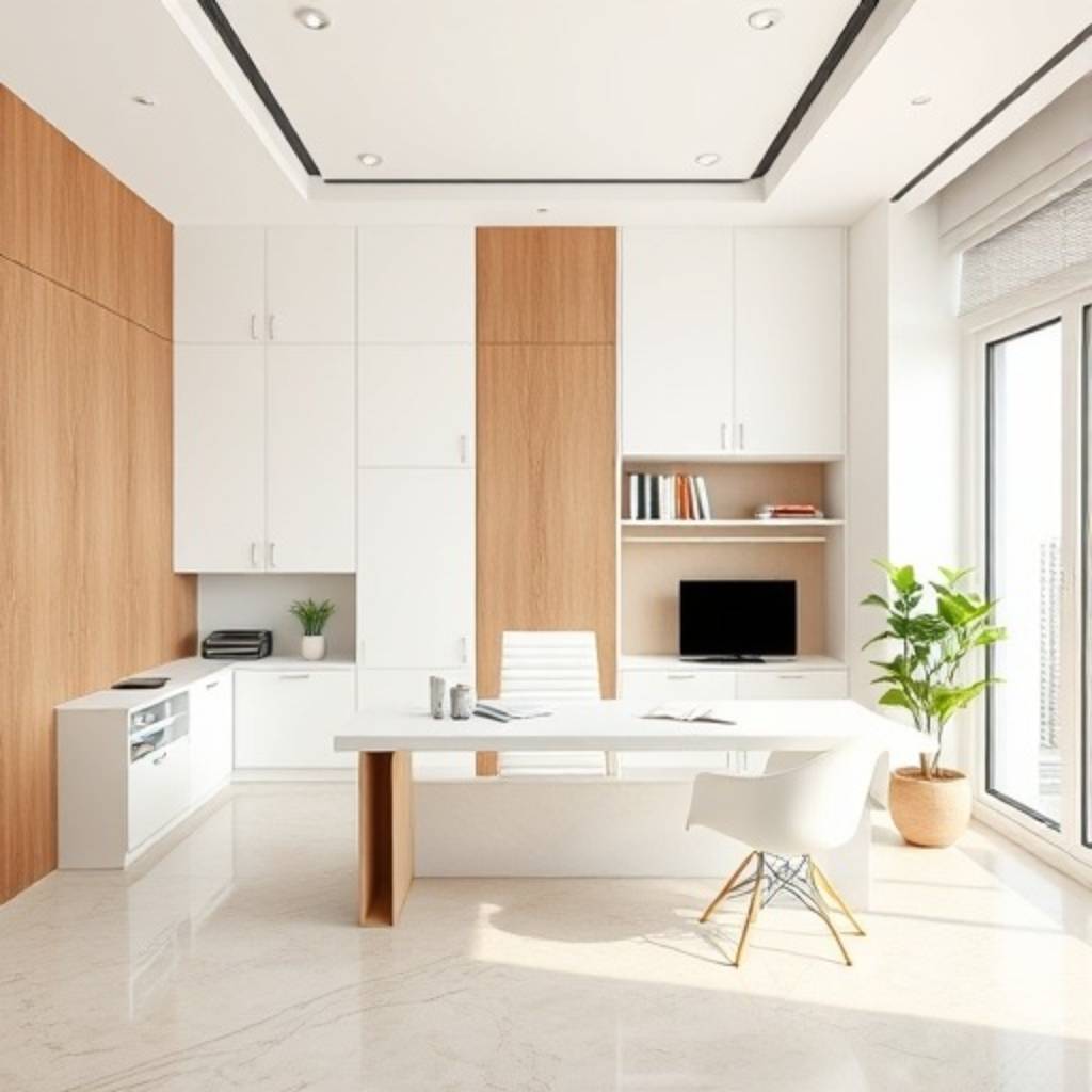
White & Wood Tones – For Clean and Natural Focus
White and wood tones create a clean, practical study room. White keeps the space bright, while wood adds warmth.
Pale oak feels light, walnut feels formal and teak brings an Indian character. For many homes, this is the best color for a study room when flexibility matters.
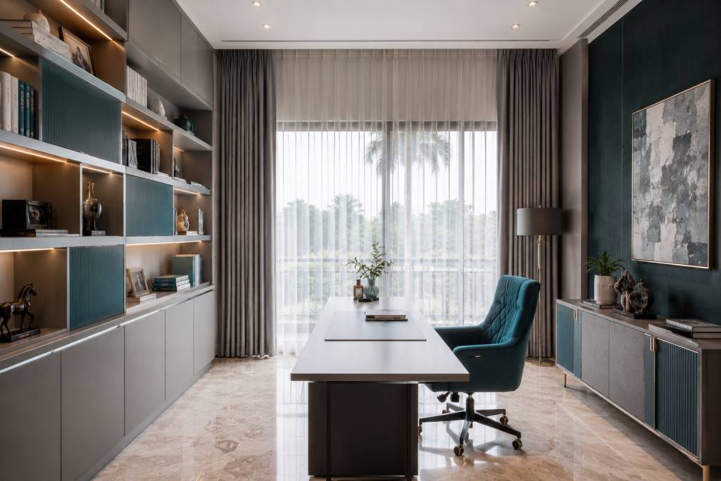
Teal & Grey – For Balanced Focus and Creativity
Teal and grey suits people who need both concentration and creative energy. Teal brings freshness, while grey keeps it steady.
Use teal through a feature wall, chair, cabinet shutters or pinboard.Keep grey as the base to keep the room feeling even.
Beige & Olive Green – For Subtle Sophistication
Beige and olive green seem mature, warm and sophisticated. Olive deepens and beige diffuses the room.
This selection works well in formal home offices, larger study rooms and spaces connected to bedrooms or living areas. Add wood, linen or brass for a layered finish.
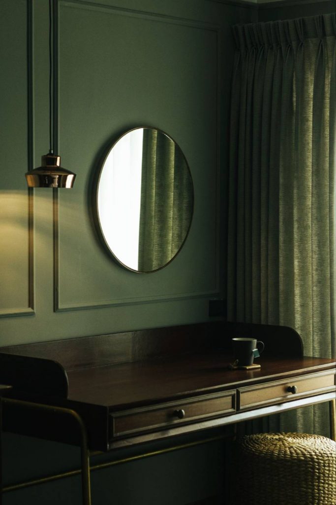
Sky Blue & Light Grey – For Small Study Rooms
Light grey and sky blue are good for modest study areas. Sky blue conveys a sense of openness which is tempered by grey.
Light grey for furniture or storage. Sky blue on walls. Open storage, strong lighting and streamlined furniture can help make the space feel bigger.
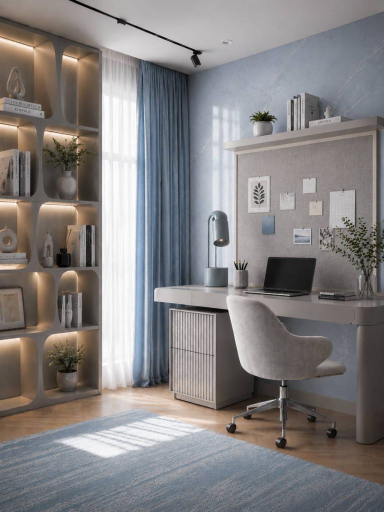
Soft Peach & White – For Warm and Inviting Study Spaces
White and soft peach for a cosy study environment that is approachable. Peach is comforting and white can keep the choice fresh.
This combination works well for younger users, casual reading corners and study areas inside bedrooms. Choose muted peach instead of strong orange tones.
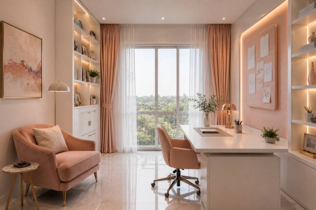
Unique Insight: How Lighting Changes Your Study Room Color Impact
Lighting can completely change how study room wall paint looks. A shade that feels restful in a showroom may look cold, dull or too bright at home, depending on the direction of light, time of day and artificial lighting used in the room.
- Check the room at different times of day: Morning light, afternoon light and evening lamps can make the same colour look very different.
- Use lighter shades in low-light rooms: Rooms with limited sunlight often work better with mint, sky blue, cream, white or soft neutrals.
- Allow deeper shades in bright rooms: A study room with strong daylight can carry olive, brown, dark blue or deeper grey more comfortably.
- Match paint with lighting temperature: Warm lighting softens beige, peach, brown and olive, while cooler lighting can sharpen blue, grey and white.
- Test paint beside real finishes: Always check samples near the desk, flooring, storage finishes and curtains before finalising the color for study room.
Before choosing the final palette, observe how the colour behaves in the actual room. This small step can prevent the space from feeling too dark, too sharp or different from what you imagined.
Understanding timeless furniture and design patterns can also help create a study room that feels cohesive, functional and suited to changing needs over time
How to Choose the Right Color for Study Room (Step-by-Step Guide)
Choosing the best color for a study room becomes easier when you begin with the room’s purpose.
1. Consider Room Size
Small rooms work better with lighter shades such as sky blue, mint, cream, white or light grey. Larger rooms can carry deeper colours like olive, brown or dark blue.
2. Evaluate Natural and Artificial Lighting
Homeowners can also explore hall wall colour combinations to understand how different shades perform under varying lighting conditions
A room with limited sunlight needs colours that lift the space. A bright room can handle deeper tones. Always check the study room wall paint in day and evening light.
3. Understand the User Type
A child needs warmth and optimism. A teen could want a lighter palette. A professional may want a quiet room that looks well on camera. A shared study room might require neutral colours.
4. Define the Purpose of the Room
For profound attention, go for blue, sage green, warm neutrals or dark blue accents. For creative work, try teal, mint, peach or bright yellow.
5. Match the Interior Style
Minimalist homes suit taupe, cream, white and wood tones. Modern interiors work well with grey-blue or teal-grey. Traditional homes can carry brown, olive, beige and off-white.
Once the room size, light, user and interior style are clear, choosing the best color for a study room becomes much easier. The final palette should feel comfortable in daily use, not just attractive in a sample card.
At Design First, the Style Test helps homeowners clarify their preferences before colours are finalised. At the Marine Drive experience, palettes can be considered with real materials, finishes and lighting, so the final choice feels practical, personal and well resolved.
Book an appointment to explore study room palettes, take the Style Test and understand how a design-to-build approach can shape an attentive, comfortable study space.
Working with a residential interior designer can make it easier to align colours, furniture, lighting and finishes with the overall design vision of the home
FAQ
Dark colours can work if utilised judiciously. A dark blue or olive accent wall can add depth and attention, but painting all the walls a dark shade might make a space appear smaller.
Light colours are easier to use because they make a study room feel open and relaxed. Dark Light colours are easy to work with as they make a study room feel spacious and serene. In bigger or well-lit rooms, dark colours might be used as accents.
Very bright reds, neon shades and highly saturated colours are usually less suitable because they can feel restless or distracting. Use strong colours only as accents.
Colours that promote study usually feel calm and balanced. Blue supports concentration, green feels restful and neutral tones reduce visual clutter. The most useful study room colour combinations avoid harsh contrast.
Blue is recognised as the best color for a study room as it promotes relaxation, concentration and clarity. Greens, neutrals and light greys are also good depending on the size and light of the room.
Light blue, sage green, mint green, yellow and warm neutrals all work nicely in student rooms. These shades help support attention while keeping the space comfortable for extended hours of studying.